Monday, 28 February 2011

End of Year Show

Some contextual research for the end of year show brief, specifically the graphics applied to the environment.


Patterns transferring across to 3D from 2D


Bold structures and repeated patterns/lights


Industrial shapes/angles/rigid/dynamic


Interesting structure carried through with graphics applied to it, not really feasible for the end of year show but still good reference


Panels? Message printed across - symbolic of different courses?


Very striking colours/lighting, simple shapes being carried through like trails


Breaking up of panels using two colours/different opacity


Trails/shapes/squares/dynamic


High impact/bold/clear/contemporary


Data/bold/ignored?


Perspective/directional?


Relating to crafts


3D lettering


Illustrations coming off the wall


All really interesting design directions and give some ideas about how graphics can be applied to the environment however before thinking more about this and how it can transfer across to print material a strong concept is needed. Something that ties together the courses and represents the college as an innovative institution.

What do I know already?

Thinking about something Mark Howe had said to me before. He said that before researching something he'll write down what he already knows so he can go back to it and doesn't make assumptions about what people already know once you know more about it.

So here's what I know (before researching)

BSL, - different to different countries
There are schools for Deaf people
Lip reading is useful
Mainly use hands or mouth words?
How to finger spell and how to say my name

Sign Station

This site is really good for giving advice about how to communicate with Deaf people within the work place. Some of the main points I thought were interesting:

For their first day at work; name badges, labels
Importance of facial expressions
Complaint of being left out in sweepstakes etc
Write things down or explain beforehand (meetings)
Problems with unconventional ways to get attentions - paper aeroplanes, tapping on back,
Instead; wave in eye line, tap on shoulder/arm or on table
Remain eye contact
Difficult for deaf people to break into a conversation - give a visual cue
Ways to communicate: pen and paper, finger spelling, signing (more difficult but even the odd word will help contextualise)
Key Issue: For most Deaf workers, coffee breaks and lunch breaks can be stressful times. In these situations, people talk about a range of topics, often unrelated to work. They talk about what was on television, about sports events, about their families and so on. They tell jokes and make funny comments. When conversation is unstructured like this, it is very hard to follow if you do not hear. People talk quickly, take turns, introduce new topics - sometimes they are looking away, it is hard to know who just added that comment and so on. Be aware that for a Deaf worker following a group conversation is hard and often they opt out altogether by reading a newspaper or doing some other activity. Try to be inclusive and to explain what is going on. Give visual clues. Point to the person who is speaking. Use gestures. All of these will help the Deaf person to feel part of the team and to reduce stress.

Hearing and lip reading capabilities vary from day to day,
When possible give an indication of the topic - write/point/gesture
Make it clear if alarms have gone off

http://www.signstation.org/10_1.shtml

Some interesting things to think about:

different structure to English - it is not English on the hands. Finger-spelling is used to represent specific English words

Deaf people watch the face when signing, not the hands.

limited access to education.

different degrees of hearing loss

vary from day to day

make your communication as visual as possible.

face them and speak directly at normal speed, while they are looking at you. Do not cover your mouth/face with your hands and do not sit with the light behind you

avoid visual distractions

waving your hand in their line of sight, tapping them on the forearm or moving into their field of vision

tapping on the desk or table and by flicking the lights on and off quickly.

Try not to approach from behind, never touch on the back or head and DO NOT SHOUT!

indicate visually or gesturally that the phone is ringing or someone is calling.

Be visual


The problem seems to be widened not only to helping people learn sign language but to actually suggest otherwise to make communication easier between those of normal hearing and those with hearing impairments. Sign language does not necessarily have to be learned to make it easier for Deaf people to feel included there are other ways which are probably just polite but because people aren't used to having to consider them they may be forgotten. (For example, making it clear they are going to answer the phone) It seems like some of the issues are about recognising things of habit and making a conscious effort to be considerate.

http://en.wikipedia.org/wiki/British_Sign_Language


Don't usually use wikipedia for reference however it did give some useful idea's for who might use sign language (inclusive of deaf people) as well as some information to do with qualifications:

British Sign Language can be learnt throughout the UK and three examination systems exist. Courses are provided by community colleges, local centres for deaf people and private organisations. Most tutors are native users of sign language and hold a relevant teaching qualification.

Signature excellence in communication with deaf people is accredited by the Qualifications and Curriculum Authority (QCA) and provides awards at the following levels:

  • Level I – Elementary
  • Level II – Intermediate
  • Level III/ NVQ 3 – Advanced
  • NVQ Level 6 – Required as part of the NVQ Level 6 BSL/English Interpreting. (This qualification was formerly called NVQ Level 4)

The British Deaf Association has formed the BSL Academy to provide an official British Sign Language curriculum and tutor training.

In Scotland, there is a Scottish Qualifications Authority (SQA) system for students learning British Sign Language. Currently there are 3 levels in the SQA system (continuing assessments):

  • SQA: Introduction to British Sign Language
  • SQA: British Sign Language Level 1
  • SQA: British Sign Language Level 2


There was also this image:


I like that they've pulled out the vowels together however I think it's strange that the letters are larger than the actual diagrams...

Tuesday, 22 February 2011

http://blog.kobayashi.eu/wp-content/uploads/2010/09/poster_rappers_1300.jpg
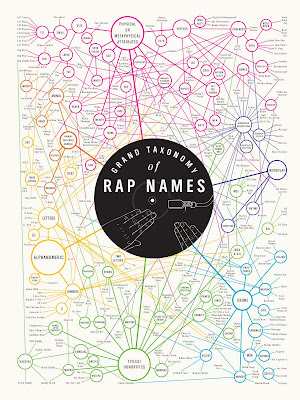


I really love taxonomy. The idea of collecting lots of things and categorising is pretty geeky but it's so interesting. And when you take something within popular culture like rap names and start breaking it down you can start to see the similarities between them and it's quite funny. Probably because you get the impression that they've come up with these original names and they really say something about that individual, but actually they're all pretty similar. On a design note, as a personal taste I don't really like type being reversed out of a coloured circle, purely because it seems to be done quite a lot but here it actually helps to draw attention to what the diagram is showing and I think it works well.

Monday, 21 February 2011


Fridge magnets for the alphabet. Seeing the example at the top it was quite interesting trying to work out the words, and I was thinking it might be good to have some sort of game where you actually match the sign with the letter or word. A bit like a card game or something.

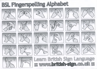
british-sign.co.uk - print out


This is another approach to the communication of the alphabet. This time the letters have at least been all kept together and rather than photographs they have chosen to use illustrations. I think the illustrations may work better since they are simplified and can communicate the relevant information but some are still a bit confusing e.g. K. Also there is an inconsistency with the inclusion of finger nails for some reason, so it gets a bit confusing which way the hands are supposed to face, obviously you can still work it out but it's just a small detail.

One thing they did have on the site was this tool for practicing signing:


One thing that I would note about this site is that although there is a lot of content it seems a bit intimidating, I literally didn't know where to start when I went on and was bombarded with options, so creating some kind of hierarchy would be useful or even hiding some of the menus.

taken from http://www.british-sign.co.uk/what_is_british_sign_language.php

Sign Language
Sign Language is a visual means of communicating using
gestures, facial expression, and body language. Sign Language is used mainly by people who are Deaf or have hearing impairments.

British Sign Language

Within Britain the most common form of Sign Language is called British Sign Language (BSL). BSL has it's
own grammatical structure and syntax, as a language it is not dependant nor is it strongly related to spoken English. BSL is the preferred language of between 50,000 - 70,000 people within the UK.
Sign Supported English
Another form of sign language used in Britain is known as Sign Supported English (SSE). SSE is not a language in itself. SSE uses the same signs as BSL but they are used in the same order as spoken English. SSE is used to support spoken English, especially within schools where children with hearing impairments are learning English grammar along side their signing, or by people who mix mainly with hearing people.
Is Sign Language Universal?
Many hearing people have the false impression that Sign Language is a worldwide universal language, but this however is far from the truth. Because of the isolated nature of Sign Language there is even significant variation from city to city within Britain, this is known as regional variation and can be thought of as being similar to regional accents and colloquialisms found in spoken languages. Other countries have their own sign language, many of which are completely unrelated to BSL.
BSL - A Recognised Language
After a big campaign BSL was finally recognised by the UK government as an official minority language in 2003. This has led to increased funding for the needs of the coummunication of people who are Deaf, and an increased awareness of the language which now has a similar status to that of other minority national languages such as Gaelic and Welsh.

BSL Website


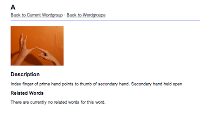
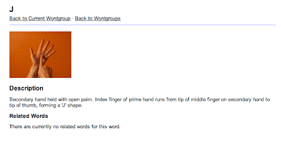
To start off my research into British Sign Language I've been looking at the BSL website, which has examples of signing for 500 words. The words are taught through photos and gifs and supported by a short sentence explaining the movement. The photo's aren't great quality and make use of an orange background which isn't ideal really because the contrast between the hands and background isn't very strong. The actual navigation of the site is also over complicated, and rather than containing all the signs for the alphabet together they are separated down unnecessarily.


Boards for pitch


Wednesday, 16 February 2011

http://www.mikemake.com/#347199/Fast-Company-iPad-Rumors


Really like this interactive information design by Michael Deal. It accompanies an article about the rumours spread up to the release date of the iPad, and deals with the information in a really usable and accessible way. The 'please roll over the points on timeline' box works really well since it gives instruction and then is used to hold the information related to the points on the timeline. I quite like that instead of using a normal, straight line timeline the shape actually takes form of the rounded corners that apple products make use of.

http://well-formed.eigenfactor.org/index.html


"
Interactive visualizations based on the Eigenfactor™ Metrics and hierarchical clustering to explore emerging patterns in citation networks."


I think the interactive nature of these really helps to separate the data and access the bits that the audience wants to know. It also means there are a whole range of visuals for the one thing and it becomes much more in depth. The lines and flow of them are really elegant. I can't help thinking though that there are so many of these infographics that are based on circles and connecting lines that when you first see it you know it's going to be something about a network or connections but the actual subject of it isn't very clear and even now I'm not sure what it shows other than maybe books referenced or something?


Also this really annoys me:


Why do the words have to overlap each other? It just means that while you're on one section you have to basically guess or start from the beginning to move onto something else. I can understand why they're greyed out but I don't understand why they overlap. Also I can't tell if they're for the rest of the diagram or whether they are actually part of that section.


Tuesday, 15 February 2011

Visualising Friendships by Paul Butler
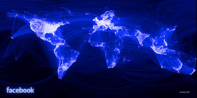

http://www.facebook.com/note.php?note_id=469716398919

This map shows the friendship networks across the world. Using lines to connect locations. Because of the connections you can start to see borders of countries and states, which is quite interesting. Again another project that shows the idea of networks etc It would be interesting to see if there was another way to show links between people or countries without actually physically joining them up with lines. Maybe using a colour or number system? not sure...


This online portfolio layout is really effective: simple, easy to understand and navigate through and still quite considered from an aesthetic point of view. Something like this could be done in indexhibit I think


http://dextro.org/

Not sure if this stuff is all part of one studio or a collection of all sorts, because the English part of the site isn't responding at the moment. Either way, thought there were some really interesting shapes and lines used within the work. Some of it is made up of very industrial shapes and very mechanical. The colours used seem to support this. The paintings however have a much more human feel to them, there seems to be something in them that makes them less sterile than the digital work.