Showing posts with label Brief 5: End of Year Show. Show all posts

Sunday, 20 March 2011

Pitch Boards


Here are the three pitch boards for the submission of concept proposals. I decided that rather than generate content and try and fit them onto boards to think about what each board needed to show, dependent on the brief we were given and then design whatever else I needed to do to fit this purpose. This helped me to focus my efforts a bit more. I'm a bit annoyed with myself to be honest, I think that I had the makings of a good concept but the execution has seriously let it down. I didn't show the full potential of it and it's down to poor time management and not designing smart.

I really need to improve my design process when it comes to these pitches because I've been getting caught up in the small details (something that is part of my design practice) and not managed to communicate the bigger picture as well as I should. I personally think that the designs for this have become really bland for the print material whereas the signage is quite experimental and a bit more fun.

poster/leaflet layouts


invites


Thought about using the panels as a sort of identity for the concept but it doesn't really communicate the idea of transition very well, also I thought about using a more vibrant colour rather than black and white but don't really like this.


Signs/Wayfinding

After finally deciding to throw my typeface to one side and use a better pre-existing typeface I started thinking about how it could be applied around the college. I quite liked this idea of using panels to print the name of the exhibition on which could be displayed along a corridor/hallway or within the entrance/above the entrance. It would be a quite bold approach and I think it could work really well, especially if the panels were quite deep themselves.
I thought about how the letters could fit within the space and whether the curves of the panels should mimic the shape of the letters, or whether the sizes should be adjusted. I think it's quite interesting but if you look at just the letters and not take into account the panels it looks like bad typography and perhaps a bit cliche.


Also thinking about the size of the letters in relation to the size of the panels and whether the panels themselves are solid or hollow.


In terms of actual directionals I wondered how this would be applied to course areas and whether this would be too much...I later decided to use a more simplified version for the directionals.


orientation of the panels? how much can you see at each stage of the route?


More simplified method of signs, probably more practical and less time consuming.


Taking elements from the type and making arrows. I think now looking back at it it could probably do with having more space, it seems a bit too condensed.


Although you can't really see it, on the left here is an idea I was developing with was to start of the word at the beginning of the design/making process and then build up on it until at the end it was a more polished version. However it was taking a long time and I didn't really have time to push this idea further without compromising the rest of the brief.


Wednesday, 9 March 2011

transition


I wanted to use a type treatment that made use of quite a strong typeface that would be able to have quite a lot of impact. I also thought that it was quite important how the letters actually moved from one to another to reflect the concept.


I tried to create these letters using the original drawing I scanned in but the letters didn't sit comfortably together, I've circled areas of problems and then printed out the letters so I could compare off screen how the letters compare to one another.

{need to scan in sheets}


I then went back to the original typeface that I liked. I liked the curves of the letters and the balance between them, its quite a harmonious typeface however too static for this purpose. Here I have been analysing the curves of the letters and how each relates to one another. I also worked out the ratio of dimensions for the letters so that I could try and apply them to my own and hopefully make them more balance. I noticed that the t and r were both the same width whereas a,n,s and o were double the width of them.


changing the width of the letters and trying to use the same rules for how the letters link to one another is starting to help, however now I am finding my eyes get stuck on the 'ans' part of the word and so perhaps I need to address the colour of the other letters to try and balance them out a bit more. Also I need to try altering the 'n' because at the moment there is a large white space there, which is probably what it catching my eye. so perhaps the width of it needs reducing.

Thursday, 3 March 2011

New Typographic Design - Roger Fawcett-Tang


Like the interlinking of the characters here, also interesting that elements have been taken out and yet it doesn't affect legibility.


I like the scattered elements., strong suggestions of movement. Would be interesting to try something like this with lettering.


Breaking up of the elements of characters.


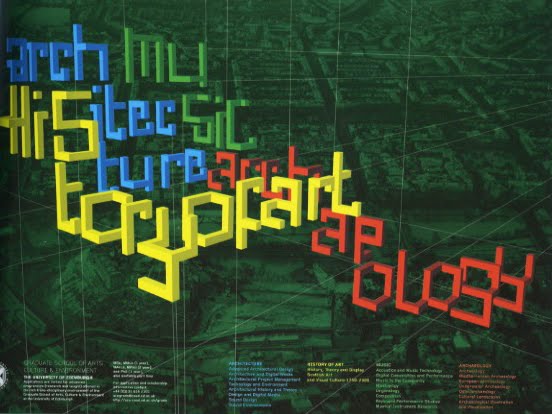
3D type within the environment. Could be interesting for the course areas or entrance.


2D type which is made to look 3D. Quite architectural/blocky


Type made from books, to create something that looks a bit like a domino rally.


Separation of words/using different depths


Like the different depths that this is created from, different sections. Idea of perspective. Things coming together to create something.


Broken type/shapes, still legible (just). Might be an idea to break up type into sections to give that impression of movement, for this I'd need to test how broken up something can be before it becomes too difficult to read.


Really like this typeface, broken up but there is a balance between delicacy and solidity.


Quite interesting structure to these letters, some are really intriguing some I really don't like. The Z has a nice balance to it the M is confusing and the K is ugly.


Wondering whether I could use shapes to build up a letterform.


Really like these rounded shapes, I think elements from this lettering would lend itself really well to wayfinding.


Layering up to create letterforms. I think that this idea of separate elements coming together to make up the characters compliments the idea of different course areas and different directions people are heading.


Potential ways of thinking about how to layout letters.


Fluid, knowing, relaxed


Ideas of how to make letters?


Letters moved around/scattered


This gave me the idea of using acrylic/perspex and hanging them so that they are layered.


The diagonal lines cutting across the words show a shift or movement. Although I don't think it works as well when on a tiled surface.