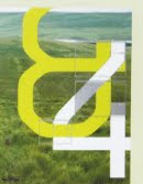
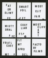
Like the interlinking of the characters here, also interesting that elements have been taken out and yet it doesn't affect legibility.

I like the scattered elements., strong suggestions of movement. Would be interesting to try something like this with lettering.

Breaking up of the elements of characters.

3D type within the environment. Could be interesting for the course areas or entrance.

2D type which is made to look 3D. Quite architectural/blocky

Type made from books, to create something that looks a bit like a domino rally.

Separation of words/using different depths


Like the different depths that this is created from, different sections. Idea of perspective. Things coming together to create something.
Broken type/shapes, still legible (just). Might be an idea to break up type into sections to give that impression of movement, for this I'd need to test how broken up something can be before it becomes too difficult to read.
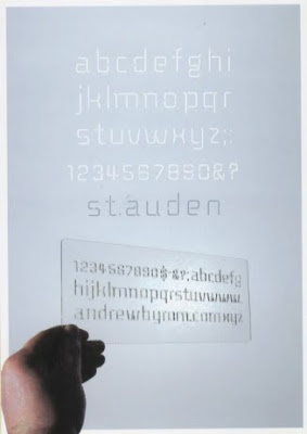
Really like this typeface, broken up but there is a balance between delicacy and solidity.
Quite interesting structure to these letters, some are really intriguing some I really don't like. The Z has a nice balance to it the M is confusing and the K is ugly.
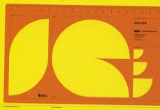
Wondering whether I could use shapes to build up a letterform.
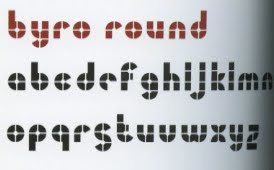
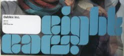
Really like these rounded shapes, I think elements from this lettering would lend itself really well to wayfinding.
Layering up to create letterforms. I think that this idea of separate elements coming together to make up the characters compliments the idea of different course areas and different directions people are heading.
Potential ways of thinking about how to layout letters.
Fluid, knowing, relaxed
Ideas of how to make letters?
Letters moved around/scattered








No comments:
Post a Comment