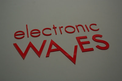
Sample of photographs for each of the printed deliverables for BSL. Photographed all the work down in the photography studio on grey paper. Found it really difficult to actually get some decent shots for some reason. Probably should have done more research into product shots so I could decide how to photograph them. Tried to photograph the entire products so I could show what they were, as well as important details to their function.
Tuesday, 31 May 2011
WALLPAPERS
Wallpapers for desktops. Tried to keep them quite simple, taking the shapes etc from the designs we already had and applying them to this format.
Brief/Deliverables/Evaluation

I think I learnt a lot about myself as a designer during this brief. It was essentially the first time I'd actually worked with a client (other than my brother last module). Unlike my brother who wanted to give me a lot of feedback about the work because he had an idea about what he wanted, working for the chamber I was pretty much given creative control. For instance with the cover brief I was asked to come up with a cover design and given the title. I was directed towards some examples of covers for other reports but I didn't feel comfortable doing it because I thought it was a bit cheesy. Not to say I like what I ended up doing anyway. Cover design is something I am actually so bad at. I think I struggle trying to sum something up and having impact to try and sell it. Also I always wait til last to try and do it and I am just never happy with it.
Sunday, 29 May 2011
Ian's deliverables

The triangles were laser cut out of a fluorescent acrylic. I then glued the pieces together using a plastic glue. Unfortunately you could still see the glue and it really annoyed me. So to overcome this I sand blasted the plastic to give it more of a matt finish. I'm really happy with how it came out and really enjoyed working down in the workshop. Wish I'd done some more practical stuff this module.
Final Renders

Entrance for the exhibition, some details are of a depth of 0.1mm so that they are flat against the wall, the circles and squares are 5mm, although they look a lot bigger than that on the render for some reason
Hemisphere, made from red plastic and lit from behind. This should be produced in light blocks that are on my blog earlier.
the juxtaposition of the two structures
Triangles and copy. Copy should be applies to the wall with either paint or vinyl.
This was all supposed to have a depth of 0.1mm but because of the rendering problem it's been left at the same depth as the one by the entrance.
This visual is to be produced using LEDs (see video below)
I'm really happy with the renders we've managed to get. It's taken a lot of time to try and work out how to do it, a lot of the time was spent waiting for things to render so we can judge the situation but I think we've got something now that I'm really happy with. Big thanks to Ben.
iPad App

Designs for iPad application, the idea is that you can interact and actually make the signs using your primary hand. This needs expansion really but I don't have time before the deadline to push it as far as I want, so it's case of continuing after deadline for the sake of my portfolio and peace of mind.
Saturday, 28 May 2011
Laser Cutting
office set up guide

Photographs of the set up guide. I'm really annoyed though because for some reason its easier to align stuff if you flip each page 180 degrees for printing. But during this somehow the alignment for a couple of things went out, probably because of the baseline grid. But I'm so annoyed about it.
Friday, 27 May 2011
Taking the research I've collected about how to set up offices and communication skills and putting it into this guide. More thorough advice that takes time to take in. For the office set up I decided to use a very simple comparison of a good and bad choice for offices. I used the colour coding of green and red to make it understood immediately and continued this through to the communication skills.
Subscribe to:
Comments (Atom)


