combining the intials of the scheme into the decoration of the arrows
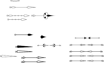
I began thinking about the themes which Time Bank consisted of, with time being an obvious one, but then the rest of the system seemed about the transferable of skills and a very backwards and forwards process. So I wanted to try and link these themes together. It seemed appropriate to try and combine time and movement and so I was thinking about clock hands and arrows. It was really difficult though to try and develop something that remained quite contemporary since decorative clocks hands are more known for quite old and antique clocks rather than more modern ones. But then I also didn't want just a simple arrow because I wanted to hint at that idea of time. I thought that by maybe including the initials of the organisation into the structure of the arrow it might be quite interesting.

I tried different ways of doing this, using a serif typeface since it seemed to fit the style of the clock hands more. The more rounded shapes of the clock hands didn't fit well and so I tried to use this spear shape instead. It was really difficult to try and combine these two shapes together without losing the identity of the other or it just looking like a mess.
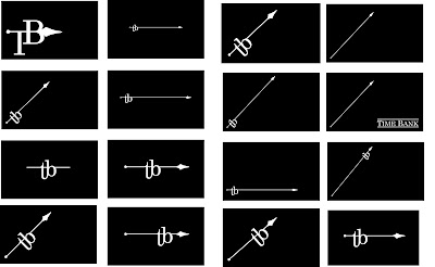
I tried to think about how they might be applied to a business card format but couldn't seem to get anything that fitted the tone of Time Bank. I decided to leave the idea of arrows behind and try to develop something else.

I still liked the idea of using imagery to do with time within the designs and started looking at these Roman numerals. Although quite interesting visually I couldn't help but think it looked way too pretentious. I was really concerned about this, particularly because the designs were in black and white. The reason I had started thinking about the numerals in the first place was as a way of people using them to mark on how long they had helped for, but the moment I took it out of that context and used it just as a visual it became almost snobby and since the whole point of the system is about equality and helping each other it seemed to contradict everything they stood for.

I thought about other ways I could visualise the brand and thought about a very geometric style which seemed a lot more contemporary and whether I could use triangles to signify the movement and position them in a way that the initials were apparent. Instead I think it looked a bit obscure and meaningless. I also played around with using a digital clock system to create the intials t and b and ways I could join them to make one shape but still be interpreted as t and b. I think the shape on the purple background is quite interesting but I couldn't help feel it was a bit too similar to the t twitter use and as an iconic networking system it's not really appropriate to use to represent another system with similar features. By this time I was starting to run out of time, I knew what I wanted to portray for the scheme and had some ideas about how the website could be used but was really struggling with coming up with a suitable identity. I had been wondering recently whether identity design would be something I could be interested in, since I really enjoy coming up with pictograms and in a way they share very similar goals but after spending a couple of days thinking about this one I knew it wasn't something I wanted to continue doing. Instead I decided to put the identity aside and start thinking about the other parts of my pitch and hope that the identity would come from that.
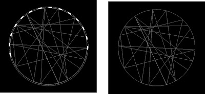
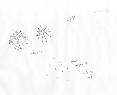
I thought about how it would be really good to make more of a feature of this network. The system they are putting into place is really interesting and a really positive thing, and since it is all creative people it seems an appropriate method to try and represent this network visually so people can see what they are apart of. These were just some quick ideas about how the network worked but there are some amazing ways that you can show networks and I'd love to be able to work on something like that.

I began thinking about the themes which Time Bank consisted of, with time being an obvious one, but then the rest of the system seemed about the transferable of skills and a very backwards and forwards process. So I wanted to try and link these themes together. It seemed appropriate to try and combine time and movement and so I was thinking about clock hands and arrows. It was really difficult though to try and develop something that remained quite contemporary since decorative clocks hands are more known for quite old and antique clocks rather than more modern ones. But then I also didn't want just a simple arrow because I wanted to hint at that idea of time. I thought that by maybe including the initials of the organisation into the structure of the arrow it might be quite interesting.

I tried different ways of doing this, using a serif typeface since it seemed to fit the style of the clock hands more. The more rounded shapes of the clock hands didn't fit well and so I tried to use this spear shape instead. It was really difficult to try and combine these two shapes together without losing the identity of the other or it just looking like a mess.

I tried to think about how they might be applied to a business card format but couldn't seem to get anything that fitted the tone of Time Bank. I decided to leave the idea of arrows behind and try to develop something else.

I still liked the idea of using imagery to do with time within the designs and started looking at these Roman numerals. Although quite interesting visually I couldn't help but think it looked way too pretentious. I was really concerned about this, particularly because the designs were in black and white. The reason I had started thinking about the numerals in the first place was as a way of people using them to mark on how long they had helped for, but the moment I took it out of that context and used it just as a visual it became almost snobby and since the whole point of the system is about equality and helping each other it seemed to contradict everything they stood for.

I thought about other ways I could visualise the brand and thought about a very geometric style which seemed a lot more contemporary and whether I could use triangles to signify the movement and position them in a way that the initials were apparent. Instead I think it looked a bit obscure and meaningless. I also played around with using a digital clock system to create the intials t and b and ways I could join them to make one shape but still be interpreted as t and b. I think the shape on the purple background is quite interesting but I couldn't help feel it was a bit too similar to the t twitter use and as an iconic networking system it's not really appropriate to use to represent another system with similar features. By this time I was starting to run out of time, I knew what I wanted to portray for the scheme and had some ideas about how the website could be used but was really struggling with coming up with a suitable identity. I had been wondering recently whether identity design would be something I could be interested in, since I really enjoy coming up with pictograms and in a way they share very similar goals but after spending a couple of days thinking about this one I knew it wasn't something I wanted to continue doing. Instead I decided to put the identity aside and start thinking about the other parts of my pitch and hope that the identity would come from that.

I thought about how it would be really good to make more of a feature of this network. The system they are putting into place is really interesting and a really positive thing, and since it is all creative people it seems an appropriate method to try and represent this network visually so people can see what they are apart of. These were just some quick ideas about how the network worked but there are some amazing ways that you can show networks and I'd love to be able to work on something like that.


No comments:
Post a Comment