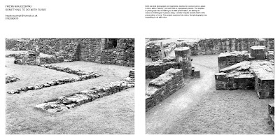
Looking at a more editorial approach to applying type, like a contemporary magazine in the way that headings are dealt with.
Idea of having parts of information in a light typefaces and contrasting with a bold version of the typeface, to mirror the concept behind the logo.
Stripping out any sort of obvious design and instead having something very blunt, with the list of information treated as though in a form


No comments:
Post a Comment